top of page

THE SEASON 5 FINAL TASK


Peyton125 - Player - doglover and Snawl
Congratulations on making it to the final of LidlTerm Season 5. One of you will walk away with the title of the grand champion of what is the most competitive season I've ever hosted. Each season of LidlTerm has been filled with competitors starving to reach the top - but you guys have truly been something beyond the usual, and as a host that is all I could ever ask for. The four of you have given your eliminated competition hell, and I am excited to see you give it to each other in this final battle.
2024-09-15
It's time for the four final collections of LidlTerm Season 5. Looking at the details and the quality of the looks, I don't even have to say it: each finalist has produced top notch work and it is a ridiculously difficult task for me to choose a winner as each collection carries winning qualities in one way or the other. What makes fashion such a mysterious yet fantastic artform is that there is an invisible logic or structure to it: it's a field in which you navigate with your gut feeling. We know if something works or not because our instincts (I like to say gut) tells us so, and it usually does so in a consistent manner. As all four of you hit very high higs both with conceptuality and technicality, I am going to choose a winner on gut feeling, rather than by splitting hairs.
This has been a genuinely fantastic season to host, perhaps my favorite one I've done. That's all thanks to you, the cast. Week after week, all 15 of you showed a hunger for getting ahead, and the design work this season has been spectacular. Hats off to all of my Season 5 designers.
Let's EAT!!!


DOMINATED BY DENIM
Peyton125 on Dominated by Denim
So lately I’ve been working on a sewing project of my own with various denim patches and sewing them together. I have always had a passion for denim and wanted to incorporate that passion into my collection.
Filip's summarized thoughts: An extravaganza of layers. You were a bit worried that creating a collection based on your love for a material was too simple of an idea. I think it’s rather the opposite. Sure, denim isn’t a revolutionary fashion approach, but centering your concept around your love for a color and a fabric is in today’s context more unusual and fresh than you might think. Today many artists stress about coming up with the next best cocktail of ideas and for you to find such a large inspiration in something more small and defined is proof you are an artist who can find beauty and make more of it out of very little. The blue hues dominate here, as they should, but I applaud your sparse inclusion of orange, purple and mint green. They bring a little bit of spice and they prevent the eye from getting tired of blue times five. Something that captivates me is that your design all looks rather high-end or upscale, but rough around the edges, as if these pieces once belonged to a wealthy lady until they ended up in less fortunate hands in a second hand shop - I love that, I love when fashion tells a little story. My expectations were unfairly high on you for this Peyton and still you managed to exceed them.

Fabulous. This looks like a wave of water (well, denim fabric) hit your model. The excessive layers of fabric embracing your model’s arms and shoulders, against the mostly naked legs and more simple denim legwarmers is great. It’s a play on different volumes. The orange details, the make-up and the hair elevate the look as well. Styling has always been one of your greatest strengths and here it’s evident. I would’ve liked to have seen a different shoe, perhaps a heel to elongate the leg in order to push the silhouette’s impact even further.


This look does a lot of heavy lifting for your collection, mainly by preventing everything from looking repetitively blue or even drab. This whole outfit looks like a corrupted character data file was rendered in a video game. The purple and beige crashing into the denim fabrics just makes it all more interesting. There’s textural chaos and conflict in the best of ways. The little patch of black and white checkered fabric is just perfect, it does its job. I wouldn’t want less or more of it. I could see this look be worn by a pop/rockstar at a less fancy red carpet event.

This is one of those rare pieces that wears itself. Usually a person wears a piece, or that piece wears the person if the balance of proportion or size or something else is off. This one is an exception to that. It has a statuesque, almost sculptural quality to it. It’s a look that is so majorly bold. That main dark blue denim structure looks heavy and I love that there is a flow to the fabric coming out underneath it that feels natural. That kind of thing can easily look forced or excessive. The orange bow was a smart addition, preventing this from just looking like a blue wall of fabric, it helps make a greater silhouette. This is my favorite look in the collection due to its monumental feeling.
A hauntingly beautiful design. Romantic in a way I can’t quite put my finger on. It looks like someone put together a bunch of separate vintage items and then went out on a mission. There’s a slightly sad and painful quality engrained in your look, but I also see a positive energy in it. You couldn’t have picked better hair for this look, it completes the whole Stevie Nicks in winter look. As stated previously, the careful inclusion of some yellowish green is fantastic, it’s another one of your tricks to bring out the full potential of the denim fabrics, by using both contrasting and matching elements.


I admire the oddness here. The unpractical and slightly clumsy nature of the denim structure. What I believe has made modern day urban streetwear fashion (think Weekday) so hot and trendy is that because a lot of the denim pieces make fun of conventionality by incorporating both unnecessary and unpractical design features. This is a big, industrial, sleeveless denim gown with a kangaroo-like belly pocket and a neck piece that goes over the mouth. I love it. That’s what I want out of fashion. The stupid, the unconventional, pieces that makes you stop and think for a little, art that isn’t always easy to swallow. It’s a bit monstrous but that’s a strength here, you don’t want to have a conforming final look, you want to make noise and that’s what you do here. As the gown looks heavy, the headpiece looks delicate and kind of frail. I love that contrast. I would’ve liked to have seen a different shoe or none at all, these ones are messing a little with the skirt and the overall silhouette. All in all, it's great.

YELLOWISMS
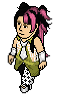
Snawl on Yellowisms
My collection's inspired by Giallo; a subgenre of Italian horror films from the late '60s, throughout the '70s. Giallo films are characterized by mystery, psychological horror, melodrama, sexploitation, lots of blood, low budgets, femme fatales, and often very colourful indoor sets. Giallo (lit. "yellow" in Italian) is considered the grandfather of crime thrillers and the American slasher films that soon followed. This is not a horror collection per se, but a paean to the era-specific fashion, pulp covers, and vivid set designs of Italian Giallo films.
Filip's summarized thoughts: Lust. Fear. A phonecall. Heartbreak. Lipstick on an empty wineglass. Cold. Stains on a broken mirror. Morning. Heat. Betrayal. A lost earring and a found ring.
Although I took the time to watch a Giallo movie (Black Belly of The Tarantula) to get into the philosophy of your collection, I don't have the same deep understanding of it as you do - which isn't a problem since you bring us all into this world the way you see and think of it. Each look here is like a fine glass of wine, each bringing me a new vision or idea. You noted that this is not a horror collection and I agree with that, from my understanding of the little Giallo I've seen, you pay homage here to the sexy, the unsettling and the air of surrealism. As I understand it, Giallo movies have an underlining of paranoia or fear to them. You mixing bright happy colors and fabrics (which the 60's and 70's were about) and yet keeping that exciting, slightly nerve-wrecking feeling in each look, in the most sublime way, shows how advanced and delicate your creative process is. It's one thing to be good at the technical aspects of design, but it's way harder to solve this invisible equation of how to capture and preserve a very specific feeling or vision. A couple of wrong decisions and the vision has flown somewhere else. You love pop culture in your own way, in a way 99 % of people don't. You love to look back, like really back. Not talking about Friends reruns or an iconic movie that is considered one of the conventional classics. You like to dig into a different, unknown cultural landscape. You search for a world beyond your own comfortable frame that is our everyday life and the media that is easy and familiar to consume. One of these worlds is Giallo. This is something I admire so much about you Brad, your thirst for more, for things and impressions once celebrated and today less known. When you combine this side of you with your love for fashion and pixel design, the result is other-worldly. This collection represents this journey you make and the love you find within it. Your collection is that lense and we get to look through it. Bravo, my friend.
A gorgeous, timeless design. It looks like an iconic vintage piece that multiple rich fashionistas would fight for in order to get their hands on it. Although it would work in any decade, it does lean a little more into Italian 60's and 70's formalwear, which is something I would've thought had I not heard the theme, guaranteed. It's demure and modest. I love how the dress and the bolero intertwine so seamlessly, it's not a conflict but rather the two separate pieces look made for each other. This is a design that takes you places, to a night somewhere in Italy where it's unsure if the night will end in passion or heartbreak or both.

A Sicilian photo model who kills with her looks. My favorite look in this entire collection. I will remember this one for a long time, it just instantly hits you. It's a bit trickier to make a bathing suit intriguing since you're working with a more limited canvas, which seems to be no problem for you here. Although it's just three elements put together, it's one of the neatest designs I've seen. The green bow next to the single patch of yellow is just exquisite. I love the addition of the black wrist pieces, without them the look might've been a little too bare. I could be wrong, but it looks like your model has a very subtle black necklace around her neck to match with the sunglasses. I love the two together. I'd describe this look as minimalistic 60's surrealist resortwear. It has a powerful feminine energy to it and although this look features a lot of skin it's not about the sex: it's about control.
The avant garde look in the collection. I especially love it when a designer is able to achieve an avant garde look without having to bring a crazy silhouette, instead what we have here is a voluminous top with a skirt. This look is where the surrealist invisible aura that can be found in Giallo films is made so visual. The hair and headpiece is like a beautiful fever dream (those are rare), I adore it, there's an intricacy and a craftsmanship to it. Truly special. If I were to use only one word to describe the garment, it would be disturbing or discomfort, which is most likely exactly what you wanted to achieve. I appreciate that there are 3 different shades of red (lining of scarf, skirt, heels), it brings a slightly higher intensity to the design as opposed to just using one shade of red. This design looks nothing like the clothes the women in Giallo movies would wear, and yet this look perfectly represents the feeling of a Giallo movie. Incredible work.
A poisonous look. My favorite thing about this design is the earring, it's one of few things on Habbo that truly looks like an heirlom, which is why I feel it has a powerful quality to it. It goes without saying that this design has an ominous feeling to it, I love that it looks a bit like the fabric parts are tangled. The deep purple is so gorgeous against that blood red. The thin nude patches on the lower side of the garment are a charming nod to the fact that you're doing a horror-movie inspired collection, they look like holes made from claws/nails or a knife. From my point of view, an inspiration here was gore and the vision was to portray a lady whose guts may or may not be coming out of her. It's disturbing but also quite fabulous. Again, you manage to make the most out of just a little.
Heat and intensity meets the cold and controlled here. The clash of the different intense prints seen on the skirt and the bag cause a throbbing, sort of riled up effect. It's fantastic. I am absolutely crazy about this jacket you've constructed, there are few things I love more than a black and white 60's style piece of clothing. You didn't jump through some crazy hoops to achieve it but you took a jacket and rendered it in a way we've never seen before. The little black hairclip is a very small but cute detail that sort of acts like an extension of the jacket, a surprisingly smart idea. To me, this design represents two types of pain. First, the sort of warm, intense, sometimes adrenaline infused pain. Second, a sort of cold pain. It's a dramatic look that makes for a great ending to a superb collection.


NOVEL NOSTALGIA
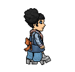
doglover on Novel Nostalgia
I named my collection Novel Nostalgia as I designed each outfit with the goal of reliving and reviving the decades I grew up in, the 90s and early 2000s. These years had a lot of interesting fashion trends so I did my best to diversify the collection, from grunge to celebrity glamor, from bucket hats to feathery pink boas. Some notable celebrities I could see rocking these outfits down the runway are Naomi Campbell, Avril Lavigne and Paris Hilton.
Filip's summarized thoughts: The early 2000's was in many ways unapologetically fun, tacky and kind of fearless, which is how I'd describe this collection as well. As someone who witnessed fashion trends come and go back in those days, as well as in the most recent 10 years, I am confident in saying that people (including teenagers) take way less risks with commercial fashion nowadays and it's been the case for a decade now. Perhaps that is why the Y2K trend is so beloved: it's an aesthetic where the idea is to ironically wear outfits people unironically wore and loved, which you in your ironic approach find that you unironically like/love. Pretentiousness and rules about being conventionally cool is out the window, left is a celebration for wearing what you think looks good and what makes you feel good. As I lay my eyes on your collection, I hear both Cobrastyle by Robyn and various Britney Spears songs play in my head. The modern fashion industry is all about what is next and although your theme comes with a strength it also comes with a weakness: you've done a strong rendition of a concept and a theme that's been on trend for very long. I do applaud your more experimental approach to it. These are not just generic Y2K clothes you'd find at an American mall in 2002, these are high fashion runway looks with your inventive fingerprints all over it. It amuses me to see that despite you having the most anxious and stressed design process before the deadline, you came up with the most joyful and carefree collection.
I'm intrigued by the prints here. We've seen that skirt about 1000 times over the decade it's been out. To present it under a plastic, not entirely transparent dress makes the red skirt more interesting, a little more elusive that is. It's reborn in a way due to your different presentation. I also like that the print on the arm looks like it both relates to the print of the skirt, while the two are also in some sort of conflict, in the best of ways. I've tried hard to like the gold accessory but I kind of just want to rip it off and let the other elements carry this look because they can. I'm glad you didn't start off with a generic or safe Y2K look but rather a more experimental take. The hat I find to be ugly chic, which is good. Although it is a strong start to your collection, it's interesting you start off with the most different look out of the five. Variety is always appreciated though.

It's amazing how crazy high good styling can take a look. If you strip this look from all the accessories and the hair, it's just a pair of pants with some green fabric over it. As a whole it's a runway look for the 2045 VMAs (you know, when the Y2K trend is hot again in 20 years). I say this as a compliment: this look reminds me of really old black and white circus photos. The pants have a bit of a vintage clown feeling to them. There's a haunting quality to this overall look, like a toy that got dumped in nature and lost most of its colors over time. The silhouette is fantastic, there's plenty of skin and yet plenty of fabric with a couple of layers. This design looks effortless but it's actually not so easy to achieve that. My favorite design element to this look is that you took a print I recognize from one of the sweaters and put it on your model's skin, making it look like white lace. The more I look at this, the more its complexity is revealed. Bravo.
I wouldn't have predicted that dark green fabric would push the whole 90's and Y2K aesthetic (which is usually related to a lot of pastels along regular red, purple and pink) you're doing a take on but I guess that was the point: you making it your own from your point of view. The top is sublime and if it existed in real life you'd have brat summer babes fighting over it in stores. It has this tickling, exciting, slightly ridiculous party feeling to it that a lot of 90's and 00's pop music was about (I'm thinking Vengaboys, Aqua etc). The pink shoe is a great addition as it ties into the top even though it's simply rendered in hot pink. I have never seen anyone take that brown belt, appreciate it's subtle green shadowing and make the most out of its potential. I've praised a lot of unique and inventive design this season, but this is truly impressive. It's an outstanding look, congratulations.
The most unexpected and perhaps the most intriguing design in your collection. At first I didn't think this was a good idea, that it was too juvenile and overly sweet even for a collection that flirts with 90's and 00's sugar pop music. Then it came to me how perfect this look is, and that this ''issue'' is rather a strength: so much of the fashion from that time was about taking a concept and running with it. There was no time for worrying about if it was too campy or cliché or ridiculous or not cool enough. Unlike today, worrying too much about being cool was uncool, instead it was about running with it shamelessly. This white and red strawberry jumpsuit would totally be something Britney Spears would wear when she put out her first album (or did promo for it). I love that this look has a slightly more complex silhouette than we're used to, considering that it's also sleeveless and short-legged. Despite that, it doesn't look forced or overdesigned but rather clean and polished. I wouldn't ever advice anyone to make a look like this, but I know you got balls for doing so and you pulled it off against the odds.
I instantly knew that this was my favorite look of the collection. It's a loud, glamorous, heavily textured, larger-than-life design completely right for closing out a fashion show. I'm not crazy about the headband and would've rather have seen an earring just to increase the glitter monster's volume with a few percent but that's me nitpicking, it looks fine. Interestingly, this design to me is the least 90's/Y2K to me. It looks like something Britney Spears (sorry about mentioning her so much) would wear in 2013 promoting Slumber Party. It also looks like a bcalla creation from 2016 or their Swim With The Tide But Faster collection. I'm not accusing you of plagiarism, it's raither observational praise. The pink, frilly little pantleg is both cute and a little hilarious in comparison to the pink mega mass behind it. It looks like its baby. Overall, an exciting look that is sexy despite being completely covered up, a look that infuses a sugar rush within me.
Player on Yuppies Revisited
So, my collection is completely inspired by the yuppie fashion in the 80s and 90s. That preppy, ridiculous/somewhat elegant look. Lots of scarves, patterns etc.


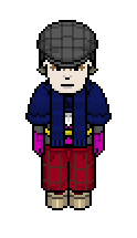


YUPPIES REVISITED
Filip's summarized thoughts: I adore the styling. The big hair, the earrings and the hats are playfully dramatic and exactly what hits the sweet spot in a fashion show: some oomph, something beyond the usual. An excuse to be extra. Your mixture of glamorous elements with what are more (historically) middle/working class pieces and fabrics, such as the brown suede jacket with padding and the denim jumpsuit, is captivating. It's a world I want to explore more. For you, this is commercial and quite scaled back. Usually, you holding back still results in you coming up with an explosion of some kind so I do appreciate that we get to see you challenge yourself and do something less expected, even though I would've also loved 5 crazy avant garde creations. When I saw your collection, there was something about it that I couldn’t quite put my finger on and then I realized it. The memory of the Project Runway season 2 judges almost twenty years ago telling Santino Rice his collection lacked a cohesive story or a red thread, it was just a gathering of really nice clothes. I believe you’ve run into the same slight issue here. The looks in a collection doesn’t have to be in the same color story, in fact all five looks can be in their own set of colors, but there has to be something that ties them together. These five designs make me think of five separate looks from a trendy second hand store. To pick two decades (80's and 90's) and base it on various, general fashion from those two decades that you love, as charming as that is, is too broad. It has to be a bit more stylistically narrow than that. A sharper, more specific point of view would’ve helped you.

Dolly Parton for Levi’s. Dolly Parton working at a sawmill in northern USA. Without a doubt the best, most impactful look in your collection. The big old school glamorous hair with the big diamond earrings against such working class clothes is both hilarious and fabulous. Yellow and orange are two colors that work so incredibly well with denim and brown suede. The orange bra that peeps out and that’s somehow connected to the backpack straps is hilarious as well, but I love that it’s inventive. I wish the whole collection was built on this: historically working class elements mixed with upper class glamour. This is a knockout, hats off to you.
I want to love this gown but instead I find that I’m in love with its potential. The kind of glitchcore/ugly hot 80’s print that’s on it is striking and I want so much more of it, more of its philosophy in the whole look. The rest of it this look is a green, classic ballgown. It looks nice but ”nice” isn’t the goal in a longterm finale. What’s the point of the shoes? They’re just annoying little stubs. I love the big, overstated hair: it would’ve been even more chic against a mini dress or even a bikini to really get something out of its ridiculous size.
I love vaporwave golf man, I wish he was my boyfriend. I love everything about this look. It’s a mix of a large number of items and it’s all in perfect harmony. I wouldn’t add or remove or recolor anything. The red almost tartan printed pants combined with the slightly heavy sand colored shoes is painfully exquisite. I love that the pants are a bit overly exaggurated in their shape because along with the shoulder pad jacket, an armor-like silhouette is made. The neon pink gloves help bring a little energy to this look, as the other colors are all a bit darker.
A fall dream. This is what people think/wish they looked like when their scarves are dramatically blowing in the wind on a mild, sunny day as the red and yellow leaves are slowly falling to the ground. This coat you’ve come up with, with all of its hypnotizing layers, is one of my favorite things I’ve ever seen you design, I want one like it in real life. It’s a look that is statuesque as hell, you could put this model in a room of full of attention seekers and most eyes would still fall on him: it commands your attention. The denim jumpsuit underneath is just perfect: it’s interesting enough as a stand-alone item but it still works very well here as the supporting star to the magnificent coat. I could go on and on about how I love this look, you should be proud of this one.
This look and the aesthetic or feeling it represents deserves a collection on it’s own. There’s something Pablo Picasso about it, something from a different time (and place) other than the world you were eager for us to take part of here. I just don’t see how this one connects to the other four. Its philosophy, both in texture and silhouette, is different. To me this look is Mediterranean 1920’s fall/winter fashion, which is a type of look that makes me drool. I love the hat and the midnight blue skirt is gorgeous. A great look to end with, but not one that exactly summarizes what the collection is about as a whole.
VERDICT
It is usually a difficult decision for any PR longterm host regarding who should be the winner, this time it was just ridiculous. Four collections that are all gold medal worthy. If you made it this far, you have already won the big prize. You got to dive deep into your creative self and give something inside of you visual life. These collections will take on a life of their own and be referenced and looked back at as time goes on, as it has been true for every other PR longterm collection ever made. All four of you have reason to be proud. As a host, to have four designers step it up so competitively and give it their all is gold, I couldn't ask for more.
Peyton125, Snawl, doglover and Player - thank you for this journey. Good luck.


bottom of page