top of page

TASK 6
YOU'RE STUCK ON ME LIKE A TATTOO


Tattoo time! I want a butterfly above my ass
Welcome to the Lidl-Wayne tattoo shop, open until the OSHA inspection in a few days.
For this task, I did a bit of a remix of my favorite task of all time: the make-up task. Instead of custom made make-up, the designers were tasked with designing a look that features a custom made tattoo set.
Here are the options that out 9 designers were offered.

FILIP'S TATTOOS
OPTIONAL LASER REMOVAL INCLUDED


ARBER'S TATTOOS
LASER REMOVAL NOT INCLUDED


HARRY'S TATTOOS
MOTHER'S HEART ATTACK


Let's see how they did!

LC22
Ahh this is just stunning. Instantly, the vision I get from this is that it looks like some light gray mass that has exploaded, like an egg or a statue made from stone, and out of it flies colorful pieces of something else. A new beginning. I believe I'm in love with this because it's so conceptual. Although I'm sure that wasn't your inspiration, to me this look has got the video game Ico all over it, as it's true to both the game and your design that there is a sentimental, slightly heartbreaking and beautiful feeling to it. I really love the choice of shoes here, I've been a bit iffy about them on the past but in this case they add to the conceptuality. It looks like the tattoo is imprisoned behind the shoes, barely visible and having a peak through a prison-like opening. It's a brilliant approach to take an incredibly vibrant and colorful tattoo and design something that has no color at all (I know black and gray are colors, but you get my point). It's so charming that one has to do a double take to recognize that the model is sporting a bag, it kind of hides with the rest of the gray details. Last week, I told you that the design was too conforming and this couldn't be more further away from that.


Cassandra.Goth
There is something vicious to this. It's like a crime against fashion, which makes it fashion. Glittery tie with a red and yellow vest, you got balls for choosing that as a combination. Your design reminds me of that type of tacky and showy aesthetic/vibe that is related to Atlantic City casinos (USA, Google it). In other words, this is not a very sophisticated look. My point remains however that it is high fashion because of its in your face character and due to the fact that it is just so different from what your competitors do and what is modern in fashion today. A lot of contestants can end up in a judge-pleasing trap, which would only be natural for someone to fall into, seeing how tough the competition is between you nine remaining designers. This cannot be said about you: as the stakes are high you've taken a really big risk here by designing something rather ugly (but also chic) and I'd say it paid off at about 75-80 % - just enough to be quite succesful. In terms of how your design relates to the tattoo, this is a great example of a marriage between the fashion and the tattoo. To the eye, Harry's luscious sunflower tattoo merges with the clothes incredibly well, to the point that they both look made for each other. I like that the shoes have a neutralizing effect, rendering them in red or yellow would've just been too much. Keep intriguing me, Cassandra! That's how you stay in a Project Runway.

Peyton125
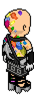
Another design from you that has made my jaw drop. This design makes me emotional, I apologize for sounding silly but I even teared up a bit. It looks like movement, it looks like new life taking off, it looks like if you took the feeling of love and made clothes out of it. The integration of the tattoo with your design is insanely good, it's nearly impossible to tell what you made and what Harry made. I especially love that you chose that blue fabric with the green-ish accents on it, they act as extensions of the tattoo, extended through the garment. I find accessories such as the green stick to be difficult and even damaging to the look a lot of the times, items that look combat-related as they have a tendency to bring the look into cosplay territory. For some reason, that's not happening for me here. Perhaps it works so well because this is an extravagant yet controlled and more or less perfectly edited design. The green stick belongs in it somehow, it could be that it makes the yellow bow underneath it even more interesting as we get to see a little bit less of it. One detail I find extraordinary is that the tattoo on the leg ends with a purple flower, and you end your look with a complimenting crayon pink. This creation of yours is one of the most inspiring things I've seen lately and I want to thank you for bringing out something emotional in me.

Snawl
Advicing a designer to start over, after they've most likely spent hours designing, is never a fun thing to do, or hear as a contestant. In the end, it most often yields succesful results. This outfit is both minimalistic and spectacular, a combination that isn't easy to achieve. I love that you chose fabrics that are similar to each other but not too similar if that makes sense: each element here has a life of its own and they all come together as one. In other words, you managed to match elements without it looking too ''matchy matchy''. Sometimes designers pair up elements that make you go ''that's just too easy or on the nose'' and yours is of the opposite, it's rather impressive. Legendary drag queen Raja Gemini once said that it is a true fashion talent to have an eye for mixing different components to make something whole (as opposed to just taking a dress and rendering it all in the same type of fabric or color) and I can say you got that stylistic eye. The tattoo simply flows with the fabrics of your look, it's as if the tattoo is doing a dance with it. I must also commend you for finding a top (the one you don't see that much of) which looks like it's an extension of the tattoo art on the leg. I also find that the black heels are really cool for this look. You're a master of making the most out of the least and this is by far my favorite thing I've seen you design in a long time.

Cinthia
To Harry: your tattoo is clearly a best seller. Moving on. Cinthia, had the year been 2016 or so, this look would've been accused of beeing too much in drag queen territory. However, ever since about 2018-2019 several big players in the fashion industry and plenty of consumers have been in love with a form of campy hyperglam aesthetic which is widely thanks to drag queens making that aesthetic popular. I believe your most high fashion idea here was to take a plastic dolphin (which is kind of hilarious) and use it to turn it into some kind of dress. The top, featuring something that resembles a mass in movement such as purple smoke or purple water, is a fabulous. Especially as it looks like it's the start of the head part of the tattoo, in that sense it must be said that you did a great job of creating a look which has a synergy with the tattoo. The red accessories are quite refreshing as well and prevents the pink from leaving a taste too sweet in one's mouth. I also love that spider-like fabric structure in the back, it's as if the tatto has been captured. If I may be picky, I don't really understand the purpose of those pink shorts, there doesn't need to be any shorts under a skirt. I don't think the fishnets elevate the look either. Overall, I find that your designs get stronger with each week and that makes me very happy.

Player
Coming from you, this is quite surprising. Not that this is some minimalistic, down to earth design. However, in relation to the fact that you are the most extravagant, bombastic designer that the Project Runway community has, this is very toned down for being you. There's a chance that due to you designers having to leave room on the legs and the arms for the tattoo, you scaled it back a little. I believe it has paid off, the design you've come up with is there, and as there is less mass to look at, it makes one appreciate the details more, of which there is no shortage. Those yellow wings are often a bit of a cliché thing to utilize in a design, although here they are quite fantastic as they achieve two things. They work as an extension to the yellow top piece, and they also integrate with the sort of electrical, stringy look of the tattoo. I've never seen this technicolor, slightly sporty side of you before and it's really fun and fresh. The skirt does an amazing job at merging with the leg part of the tattoo and I believe this is the coolest use of that skull accessory accessory I've seen. I also appreciate that you gave new life to those suspenders, we rarely see them rendered in a more unique way like this. Another great design from you.

ohku
This is crazy. You have a personality that is quite festive and I believe that is mirrored through your design here. It's also a design that is distinctively you, it has a theatricality to it and it's bold. As a designer, one should never let go off that theatricality if it's there. Unless one learns to mount it properly, however, it can make your design end up in costume territory, which sort of happened here. The mask and the flower beard aren't conceptual in a high fashion way in order for them to be justified. No one can deny that you embraced the tattoo, it quite literally looks like you drew inspiration from it and just continued it's story. As I created this tattoo, it warms my heart to see you give it a sort of rebirth. I appreciate this creation for what it is: it's whimsical and beautiful. It's a fantasy, it takes you somewhere. I'm sad to say that there is one critical thing hurting you here, and it's that there is little to no balance. As the task was about finding synergy with the task, it was also about making both your outfit stand out along with the tattoo. Here I find that the tattoo kind of drowns and it looks secondary to everything else going on. As designers, what we choose to include is as important as what we choose to not include. Although I love the avant garde nature of your creation, I would've liked to have seen it edited down a bit in order to shake off that mardi gras vibe it has.

doglover
The fact that you chose sandals because you wanted to showcase a tiny bit of the tattoo that extends to the toe is both charming and shows the importance that smaller details has for you. There's something a bit psychadelic to this look, for some reason it also brings me to a certain New York style type of fashion from the 1980's. Most likely due to the fact that the specific style I'm talking about was about mixing sportswear with R&B as well as mixing a lot of colors that weren't so bright but not dark either. It's not often I get to see something like this as a host, so hats off to you. Your look acts as a battery, an energy source, to the tattoo. The tattoo has it's own life and speaks for itself, but it's still very well connected to your look, which underneath the layers give the viewer a promise of an epic color and texture story going on. Again, the sandals are an unusual choice for Project Runway, but I like them here as they add to the laid back street protagonist vibe that's going on. It's one thing to be good at the techical aspects of Project Runway, those can be learned. You have that mostly down, but you also have something else that cannot be learned: a vision and a sense for fashion. There is something so creatively raw to this. Another incredible design from you, Chris.
VERDICT

Congratulations Peyton125 - you are the winner of the sixth task of LidlTerm Season 5, making this your second win. There were plenty of outstanding designs this week, what makes yours edge out the others just a little bit is the fact that it has an emotional quality to it, as well as the synergy between tattoo and outfit being extremely strong. Well done.

Snawl and doglover - the two of you came up with work that is truly inspiring, which has landed you in the top this week. Both of these looks are technically masterful and you should both be proud. Keep it up like this and a spot in the finale will be yours.
ELIMINATION

nicrobbo95 - you have been disqualified from LidlTerm Season 5 purely based on the fact that you have failed to submit. I'm sure you were incredibly busy with various things in your life this week and I want you to know that we all appreciate and support you greatly. Some of your designs have a romantic quality to them that I've only ever seen you achieve and you also have a knack for coming up with spectacular urban streetwear designs. I hope to see you in a longterm soon again as it's only a matter of time before you win one.
Also - nobody chose Arbers tattoos! Arber, perhaps the cast wanted to punish you for those custom emoji critiques at panel 2, or perhaps they were afraid to mess up your perfect work. I speak on behalf of everyone when I say that they're gorgeous work and as a host, it's a true privilege to have someone like you on the sidelines contributing * sends big hug and a tiny slap on the butt *.
I'd also like to direct a big thank you to Harry who was so kind to contribute to this task. He made about 10 tattoos, edited them, sat on them, thought about them - all as if this was his own longterm. Your commitment and artistry is on another level * sends another big hug *.
For full rankings, please visit the Progress page (click here).
bottom of page