top of page

T̷̡͚̞̲͕̼̙̯̪͒ͅÁ̸̡͎̲͖̙̰̞͈̥̩̤̥͔͓̓̀̅̕Ş̸̭͚̱̞͖̗͖̻͈͚̙͕͌̿͑̇̑͒̀K̷̢̧̻̮̳̮͉͍͉̰͌͜ ̵̨̻̿̓͆̃͋5̷̪͈͇̳͆́̾̑̈́̑͗̚̚͘
MIRROR'S EDGE
Your concrete heart isn't beating
And you tried to make it come alive
No shadows, just red lights
Now I'm here to rescue you


We're halfway through this season of LidlTerm!
It's time for the fifth panel of Season 5!
This task was about a video game (including its soundtrack) and an aesthetic born out of it: Mirror's Edge. Most people probably know that I am a sucker for emotional and bleedy stuff, whether it's music, movies, games, poetry or fashion.
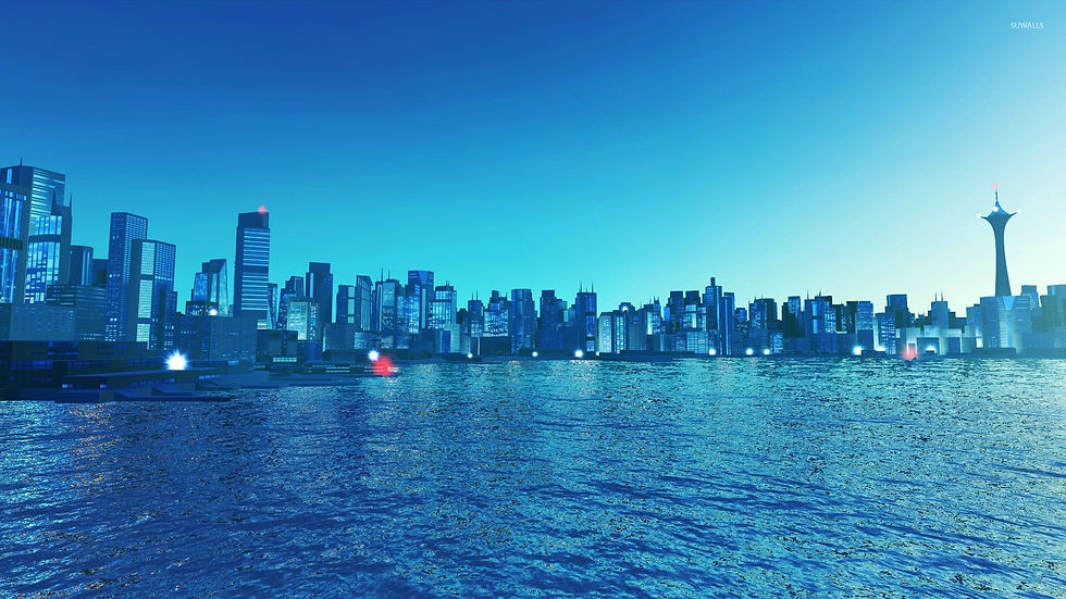
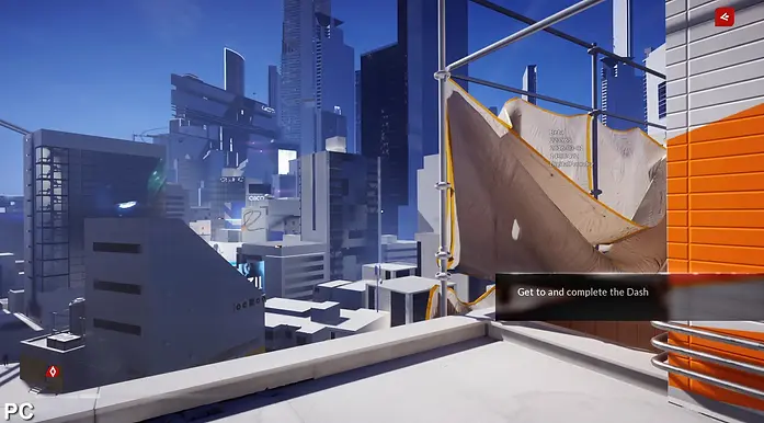
Mirror's Edge is set in a futuristic city where a totalitarian regime closely monitors and controls communication. The player takes on the role of Faith Connors, a "Runner" who operates as a courier to deliver sensitive information while evading the surveillance and enforcement of the oppressive government. The story revolves around Faith's quest to uncover the truth behind a conspiracy that involves her sister, who has been framed for murder.
We are living in a society in which things such as control, tracking, anonymity, identity and digital personal information (data) are topics which are symptomatic to our more or less current dystopian time, which is another reason why I found this task to be relevant.
This task is about capturing the aesthetic of the video game Mirror's Edge, the feeling of the soundtrack (if you dislike it you can disregard it) and the unique core concept and visual of Mirror's Edge: it's set in a city that on paper has most elements which most people relate to utopia. Shiny buildings in soothing colors, cleanliness, a vibrant energy, sunshine, an industrial city without any of the filth or the ugliness and overall a high-tech society. However, Mirror's Edge is about a dystopia that is a visual utopia. It makes it interesting because a dystopia is usually rendered as dirty, dark, filthy and a little bit left behind.
For this task, I wanted the designers to capture that abstract darkness in a design that utilizes brighter (and/or neutral) colors and that has a certain emotionality to it. I asked for there to be an urban vibe to it and something rebellious and adventureous about the look.
Let's find out which nine designers managed to dodge elimination this week.


Cassandra.Goth
I didn't think much of this when I first saw it, feeling it was too pedestrian, but now I've warmed up to it. It looks like you've taken a more formal vest with a matching pair of pants, tortured it a little to give it a more rugged texture, and then added a yellow hoodie with a tote bag. It's rebellious character comes across the more you think about it rather than when you get your first impression of the look. Another aspect that I really like is the clash of prints: you have the more current print with the dots on the handbag against a more timeless eastern print on the sleeves. The two play off each other in an interesting way. The hoodie, although it is perhaps a tiny bit cliché in relation to portraying an urban rebel, does have a pay off as one cannot go wrong with it. There's a reason writers and stylists for various TV shows, movies and video games keep utilizing characters with hoodies (that are folded up over the head), and it's because it unexplainably but undoubtedly sells the idea that you're viewing a down to earth underdog. I also find the lifeless gray against the striking yellow to be a cool pairing. Again, you pulled this one off.


.Cow.
I just don't know about this one. It definitely has got something going for it. There's an idea and a concept here, as well as an interesting character on display, which is one of the best things about fashion. It can tell us a story or suggest a character without saying a word, instead the clothes tells you silently. The red and blue composition is quite intriguing, it has something alarming about it (in a good way) and overall there's a sense of conflict to it, which is something perfect in relation to what this task is about. I especially like the smaller details, such as the little red bits on the gloves and the metallic gray shoes which both give the overall look a greater textural value. There's a lot of black, which isn't entirely the issue, you can rarely go wrong with black as long as its use is sophisticated. I believe what is throwing me off is the stetoscope, it's an incredibly tricky item to pull off in a look and I'm afraid you don't climb that obstacle, behind it there's an organized chaos going on and the stetoscope makes the overall effect slightly messy instead. I just want to pull it off and behold the cool design behind it. There is so much that I like about this look and it's so close to being great, but I'm afraid it's in the need of an edit.


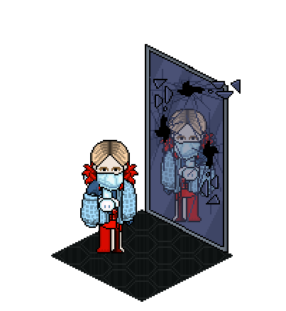
nicrobbo95
You told me upon submission that your inspiration for this look was one of the promo pictures for Mirror's Edge in which the main character Faith is looking into pieces of broken glass (click here for reference). Your broken glass inspiration, although it isn't rendered in blue, gray or any other glass-like color, comes across clear and I'd say it was a source of inspiration that paid off. As a host, it's fantastic to see when a designer has an original, clear vision or idea and then executes it in a way that lives up to its potential. There is something a bit industrial to the orange top which is suitable to the theme and the turquoise heels give the look a certain kick. One prominent factor in Mirror's Edge is adrenaline and I find that the heels represent that a little bit, while the main outfit portray destruction and defiance. When one creates illusions using black, one has to be careful because every single decision taken during the creation of a black illusion in a look has to be right. I'd say this is 75 % succesful. As said before, you achieve the broken glass effect fantastically, but the black scarf and the sunglasses are overkill, they add a certain heaviness to the look that isn't necessarily relevant to the vibe I believe you were going for. Overall, this looks corrupted as well as thrilling and I believe your love for urban streetwear helped you.


Sparkle
Regarding that sparkly see-through dress, no one can say you didn't represent yourself, considering your nickname is Sparkle. I am a bit confused by this. This design, which does get points for unique ideas, comes across as a delicate and kind of precious - which the task is not about. With the Mirror's Edge theme, I was asking for fashion that represents an urban rebel whose fuel is adrenaline and who cannot take another day for granted. This blue gown has something dreamy and soothing about it, sadly I can't see that whole dystopia dressed as utopia thing going on with it that I relate to Mirror's Edge. It has to be said that you did not disappoint in the creativity department. I don't think anyone has seen a dress like this before and I find this look to be a bit of a riddle, it's hiding something while at the same time it tries to sell the idea that it's got nothing to hide because of its sheer fabric. I must commend you on the fact that there is a certain vulnerability to the look and one detail I do think is in line with the task's theme are the red upper arm details, there is something agressive and protective about them. I'm a bit worried whether you can continue on with this creativity of yours and focus it in a way that is necessary for upcoming tasks, since you got tough competition.
Player
I was quite harsh with you last panel, and I genuinely didn't know if you were going to embrace a slightly bitter pill of a critique or throw it away. You did the former and I'm so glad you did because it has yielded results. This is by far the best thing I've seen you design in a LidlTerm season. What you've done here is to focus in on more specific aspects on a concept or an idea, your creative work here is more centralized rather than all over the place, which has been the case with you sometimes. The contrast of the one monochromatic leg against the more texturized, gory red streak that kind of forces itself past the other red element is fantastic, to me it mirrors the spirit of Mirror's Edge ''I will get past you no matter what''. The softer blues against the alarming red is a color palette that perfectly sums up the feeling of Mirror's Edge, it's about vulnerability, the beauty of living and also becoming a rebel to fight for those things. Those earrings (or ear pieces?) would easily look tacky but in this instance you make them fashion forward through that bold red, they add a bit of controlled chaos and prevent the look from being too conforming with the blue colors. I'd call this urban avant garde streetwear which is not easy to pull off, so you get points for innovation and originality. If you design like this every task, you will make your competitors piss their pants.


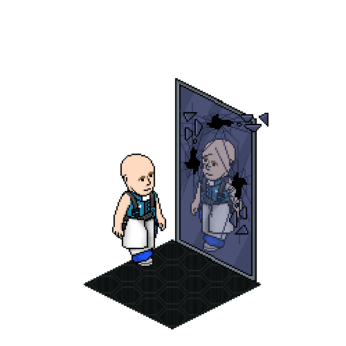
doglover
You are taking a bit of a breather, it seems like. That's perfectly fine, no one performs at a 10 all the time, not to mention you were at an 11 last week. You are competing against what seems to be like the hungriest LidlTerm cast I've seen across 5 seasons, so to come up with a look that isn't outstanding is slightly dangerous. Not that this look lacks great design. Those pants, which look like someone took two pairs and sewed them into one, are superb. It's hard to say where the pants end and the shoes start, making it a rather avant garde pair of pants which we rarely see. I also adore the broken glass accessory by your model's eye and what seems to be like black threads or some other small pieces dribbling down from your model's neck down to the chest area. Although I've never seen anyone construct a tote bag like that on Habbo, I just wish it was paired with a top that was more striking. I'm not sure why this look doesn't hit as hard as it has potential to actually do, because there is a lot of great stuff here. I'm guessing it is that you've come up with several great design elements here but perhaps they're not meant to be with each other. Just imagine this look with a bulkier industrial jacket. I can see your thought process though, I believe you wanted a lighter top to sort of portray that parkour style easy to move in look. This look is like a brilliant appetizer but I'm hungry for the main course.


ohku
There is one design element here that made me almost gasp because of how good it is: that turquoise mosaic texture. Who would've thought you could take the butterfly mask, achieve such a cool texture and then more or less perfectly replicate it through an integrated hair accessory?! You're in this competition under the same circumstances as everyone else, but ever since you've entered you have been in your own lane, doing your own thing. It's as if you design by using yourself as a template, which makes everything you do so fun and fresh. You've got a momentum going for you and I am begging you to not stop. It's also really nice to see how you chose a pair of shoes and colored them in a way that is coordinated with the turquoise mosaic accessories. I'm a big fan of the headwrap, it looks like a dirty dishrag found in an abandoned building that your model chose to make something fabulous out of. The red gloves help give this look a bit of oomph as well. The only issue with this look is that the dress itself isn't nearly as interesting or impactful as everything else that frames it. It's alright, I am intrigued by the subtle texture on the shoulder but it feels like a peak of what could've been. The rest of the dress kind of drowns in itself, that scout accessory is rarely a good idea and this was no exception. Overall, your fabulosity came across here once again, while there is still growth to be made.


Cinthia
Cinthia, each panel you just get better and better. I believe that's one of your strengths as a designer: sometimes you lose your track and stumble, but you take critiques and don't see it as an attack on your ego, rather a roadmap on how to excel for next task - resulting in you coming back stronger each time. I loved this look the second I laid eyes on it. Mirror's Edge, and especially the theme song Still Alive (which I know was your main inspiration and that makes me so happy), is about a certain vulnerability. It's about wearing your heart on your sleeve in a rather bleading way and at the same time making that a source of strength in the quest to reach a higher freedom and a better life. All of that is portrayed in this look. It's a bit sad but in a controlled way. Your model is chained, which is probably a bit cliché, but your model doesn't look restrained, there is no sense of defeat but rather the opposite. The tattoo-like chest details are intriguing, it's hard to tell where they begin and where they stop, that vagueness is quite impactful. The pearl headpiece, which I love on it's own, was not a good idea. Along with the blue color palette, it brings the look into a nautical area which is not in line with the urban feeling of this task. Overall, you're climbing in this competition and I see no reason as to why you should slow down.

Snawl
You're a designer who has an almost unusual love for playing around with all colors and unveiling their potential, although when you work with blue, I've noticed you come up with work that one cannot fault. You told me that your source of inspiration was the feeling of hope that embraces the main character Faith as she navigates a bright city which, although it tries to stop her, becomes a bit of a symbol for a potential bright future as she unapologetically makes it her landscape of her fight for freedom. Although you use slightly melancholic shades of blue, the feeling of hope is evident in this look. Perhaps due to the fact that you added two big pieces of white fabric which sort of makes the blues look brighter than they actually are. The single navy blue pant peeking out I find to be charming and this is one rare instance in which you are able to take that extremely overused industrial harness and turn it into an accessory that looks brand new - the innovation here must be acknowledged. I also like the decision to keep the head bare - I always prefer a bit of hair but I cannot deny that focusing the design aspects entirely below the model's neck was an impactful choice. I love the power that is intertwined in your design, I look at this and instantly imagine your model is on a mission with great determination. My only negative critique to you is that the shoe is a missed opportunity, it could've been a bigger statement. You're another designer this season who keeps achieving better results with each week, so keep it up!


LC22
Not factoring in the fact that I do know you personally and speaking exclusively about your artistry: you are one of the most non-conforming ''I'll do whatever I want!'' type of designers. You never submit anything you don't personally love and to have a designer who puts their own taste first is something extremely valuable. I'm saying this to make a point about your non-conformity. This design, in relation to what this task is about, is surprisingly conforming. I wish you had honed in more on your rebellious colorful rocker chic side. This doesn't look like a protagonist but rather like a guard or a soldier for the authorities, although I realize I didn't ask for you guys to make protagonist-looking fashion, so I cannot fault you for that but it's still an important point. I lack the sense of adventure and adrenaline here. Focusing entirely on the design elements and the technical aspects, it should be noted that the compositions of the black pieces with the yellow trim are so incredibly well done, they have this slightly futuristic high-tech feeling to them without it looking gimmicky or losing the fashion aspect. I especially love that glowing neon blue that is hiding under the vest, to include just a tiny bit of something and leaving the beholder wanting more is one of the best things you can do with a design. I'd alsoo like to note that the gray hair against the baby blue palette looks striking, easily one of my favorite styling choices I've seen you pull off. This is not your best work, I'm afraid. I've seen you come up with savvier stuff than this.


Peyton125
I think I'm not alone in wondering what's been going on in your head this week, never have I pushed a designer into a corner like this and leaving them with the choice to crumble or roar back. I'm delighted to say that you did the latter. Over the longterms I've seen you do, it has seemed to me that your artistry has been brewing - your looks have all been engrained with a promise of your immense potential but also a telling of you not being there quite yet. Fast forward to this season, in which something has happened, you've exploaded as a designer, reaching an entirely new personal level for you which we've not seen before. That is why I gave you this do or die moment - it was time to see if you had previously been a bit lucky or if you really were ready to design in a way that is maximizing your abilities and going for the gold without buckling under the pressure, which has happened to almost everyone in the PR community (including me, see Snawlterm Season 5). This design is marvelous, Peyton. It's got a sense of chaos to it, tamed by that elusive and neutralizing scarf. The turquoise against the burning shades of red makes for an interesting contrast, it's a war between the two that is broken up by the white layers. That conflict between the harmonious turquoise skirt and the intense red top is in line with the Mirror's Edge philosophy. I love the way it looks like the one sleeve is made out of silver, clashing with the red. Despite the many design elements on display, you somehow achieved a balance by the way you structured things: it could've easily gotten messy but thankfully this look isn't overbearing on the eyes.
VERDICT

Congratulations Player - you are the winner of the fifth task of LidlTerm Season 5. After being in the bottom 2 for two weeks in a row, your tenacity has paid off. Your design represents a sense of avant garde that is true to your artistry and you managed to come up with a dynamic look that involves both harmony and conflict. This is one of your most focused design, your explosive creativity is here presented within a set of frames, making it easier to appreciate both the silhouette and the accompanying details. Keep it up!


Peyton125, your look tells us that you worked hard this week, and it has paid off. You have been ranked as second best this week, and thus you are safe from elimination and free from my punishment. Well done. Keep in mind though that you have eight competitors who all have tricks up their sleeves, so now is not the time to relax. Snawl, you have been ranked third, congratulations to both of you for coming up with stellar looks.
ELIMINATION


.Cow. and Sparkle - it breaks my heart to say this to two designers with such heart and talent, but you have both been eliminated from LidlTerm Season 5. You both had good looks, but you were sadly edged out this week.
.Cow. - the reception you've had to your comeback is a testiment to how beloved you are in this community. You have your own aesthetic as one can always tell if you've made it or not and that is very special. In my eyes, you're one of the PR legends as you've earned that title. Thank you for taking part this season, I really do cherish you.
Sparkle - you are one of the most intriguing PR designers I've ever seen. It's hard to put into words, but there is something very raw to your style and your creativity that always leaves one wanting more from you, which is still the case for me. In a year or two there is no doubt in my head that we will see you as a finalist in a longterm. Thank you for taking part this season, I appreciate your efforts and your designs a lot.
For full rankings, please visit the Progress page (click here).
bottom of page