top of page

TASK 2 I'M A WORK OF ART


Hello and welcome to the second panel of LidlTerm Season 3! For this task, I asked the designers to create avant garde fashion based on paintings created by AI. The AI created the paintings based on each designer's Habbo username. I absolutely love avant garde fashion so you are in for a treat with this panel. Let's go!

alydaman


An avant garde suit. All I have wanted for years is an avant garde suit. Thank you. It looks like your design went through a shredder and your model decided to wear it anyway. I haven't got a clue how you managed to put those blue/purple shoulder pads on the suit but it's an interesting detail for sure. I love that this whole design relates a bit to your final collection, this is like a British rockstar saw it and wanted a design like it for a red carpet. Some designers struggle to make grays and whites look cool and other designers have developed that sense of how to make lots of gray and white to look really cool and you're one of them. The suit is an iconic piece of clothing and it's been done in thousands of different versions, yet I've never seen one like this. Even if your model stood still it would still look like the fabric was flowing/moving. You had the most difficult painting this week and you came up with one of the best designs this week, hats off to you.


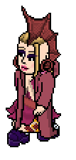
herbymainsted
Let me start by saying that I really fancy the heels and the purple piece that you've constructed is absolutely fabulous, I'd call it avant garde for sure. I even appreciate the silver tits a little. The huge problem is that this feels like a costume to an extreme point, I adore green and yes you did have a difficult painting to work with. The dress looks like something from a child's play, it's literally Tinker Bell's dress. I can't help but to hate it. The combination of purple with green was actually a good idea, look at how good that right glove looks in combination with the purple fabric. You don't seem to be mentally present for this longterm and it shows, if you survive this week then I hope that you get your head into the game.

austin@troy


I totally see water by the sunset in your design, which I also do in your painting so well done on that part. I'm sad to say that this isn't a very avant garde design, some would interpret it as that but subjetively I don't. This is a gorgeous dress that showcases your greatest strengths as a designer: an impeccable ability to select a captivating color palette as well as a developed fashion sense. In another task this dress would've received a high ranking. Your problem in Season 1 seems to be present once again: you're a bit scared to leave your comfort zone regarding silhouettes. You did show me a different outfit but it wasn't as good as this one. It is absolutely necessary for you to further challenge yourself because your love for a certain silhouette is the only thing that is holding you back. Some advice: for next week you could try to do something that isn't a dress, maybe a suit or an outfit with separates? Overall I find that you did your painting justice and that was an important aspecto f this task. I adore the various textures on display and the partly white shoes help neutralize the design from looking too warm. I cross my fingers you get to stay for next week and grow as a designer, I say that because this week almost everyone brought it.

nicrobbo95


This is why I host longterms: to see divine outfits like this be the result of mixing a couple of wardrobe items. When you described your idea to utilize lace I was intrigiued but also worried as that is a very difficult thing to portray succesfully. I am happy to say that you couldn't have done a better job. Sure, there isn't a ton of lace but the Habbo wardrobe is a bit limited and your vision came across with just the amount of lace on display. Your design makes music, I can't help but to see it in a music video in my head in which your model is posing in a windy landscape. The choice of using white was smart as it plays with the lace nicely, I must also commend you on the color palette as the touches of gold, mauve and blue work beautifully together. I adore how this design mixes softness with a more solid structure. Honestly, this is a complete wow-moment for me. Some might say that it borders on costumey but I find that you made subtle, tasteful choices that took it into an editorial direction instead. I was worried about you the most for this task as you're one of the designers with the least amount of longterm experience, when I look at this design I get worried for the other competitors instead.

ZOETIC


Well done on doing the painting justice regarding the colors. Once again you've shown a great understanding of arranging shades in a design because the choices you made with the skirt and the shoes are really neat and gives the design a greater depth. I understand why one would incorporate the poncho but I can't help but to dislike it, sometimes design elements can make sense and yet they just don't look that good (and vice versa). The hood/turban that is highly unique, creative and the execution is superb. I always love to see completely new items being created on LidlTerm and the hood/turban is one of my all time favorite single pieces I've seen. Creating avant garde through the Habbo wardrobe is perhaps one of the hardest things to do in PR as we're limited to a sertain cet of choices, unlike real world avant garde designers. You didn't just succeed at creating avant garde fashion but you've also shown that you have a deeper understanding of your own artistry. This design is even a bit Salvador Dali, who couldn't imagine your model wandering the desert in this?

FIERCE.NEEDLES


This takes me to a time and place and it's probably completely impossible to look at your design without not seeing some kind of a story, specifically this design reminds me of the aesthethics of the video game Ico. I find that your design is packed with tiny details and yet no element of this look is trying to steal the attention: it's all done in a very subtle manner and there is harmony to it. Avant garde doesn't have to be about big silhouettes with tons of volume, avant garde designs come in many shapes and forms and I'm grateful you chose a route I rarely see in task like this. As soon as I saw this it came close to my heart. Your choice of fabrics and items makes the design look decomposed in a very beautiful way. The mixture of beige, sand, gray and iron is fantastic and it emphasizes the cold aura that I believe you were going for. It's always risky to utilize sandals in Project Runway but I believe they're perfect in this context: this design consists of a lot of round and tinted shapes so having sandals that are almost entirely square is a great contrast. I could rave about this design for so long because it just keeps on giving, the tiny bit of red is brilliant and overall I see serendipity and heartache in your outfit.

RAZZING

This wasn't your first pick, you wanted to submit another design but you told me this was the one you loved. Some advice to you and everyone else: it usually shows in a design when the creator has love for it and it also shows when it just feels forced, always go with your gut feeling! AND REMEMBER TO HAVE FUN!!!!!! Back to you Peter, you're treating us to this cool 90's New Yorker who is attending a club. The mixture of the two skirts is fascinating and without a doubt one of the best things you've done. The midnight blue shoes couldn't have been more perfect as well. I also appreciate the clever way you merged the earring into the head fins. You told me you were worried this look was too much drag queen and yes, it surely has a foot in drag territory but the truth is that fashion inspires drag and vice versa, the line is very blurry. I usually think that styling (hair, accessories, make-up) is what makes something drag or not on Habbo. The make-up and the headpiece is very drag but if this was ever a PR task to give a certain extravaganze that is usually related to drag, it is this task. Overall this is a crazy concept and the execution is great, despite all that is going on it doesn't feel overdesigned or messy.

SNAWL


Your painting showcases a lovely mixture of knick-knacks and green/yellow fabrics and I definitely believe you did the painting justice. However, you didn't do yourself justice on this one. You told me you wanted to create something outside of your comfort zone as you have a great history of designing with green, which I appreciate from you Brad. The thing is that sometimes doing the obvious thing is the best thing to do, when I saw your painting I thought you would annihilate your competitors as it directly relates to a strength of yours. Instead you played some mental gymnastics with this one and the result is just ok. On a positive note, you have an incredibly defined aesthetic and you managed to create something avant garde while it's also a design true to you, which isn't easy. The problem is that there isn't a harmony anywhere in your design, it's like your items are mad at each other. In other words there is no flow when it's desperately needed. I also have a really hard time with the beige cape and the brown shoes. Your best work is usually acquired when you don't overthink and when you just feel and do and have a free source of inspiration, perhaps next week we will see it from you.

buyartpop


I've looked at this design 4 times and everytime my reaction is ''woah'' because the design hits you like a slap in the face. This design is what I call ugly-fab, meaning it's not pretty but it's editorial, high fashion and high in creativity. There's a clear concept here and it's fully executed, it looks wet, it looks electric and it also looks a bit like a bath mat. I wasn't too sure about the hair but I've come to the conclusion that it sells the look. I've known you for years and you have a very defined aesthetic, meanwhile Lady Gaga inspired your name and hence your painting. Even though your personal style is close to Gaga I still find this to be original while it also connects to your past and your passion in life. The big, clunky silver shoes are amazingly suiting to the dress. This design of yours showcases your developed understanding of fashion and the avant garce scene. I'm also very happy to see you avoid black as you gave tons of it last week. In real life, a look like this might not have been deemed the best look at a red carpet but it would've been a look that trended on social media. Please keep surprising me!

lc22


Is this an avant garde design? I'd say yes but also no. Avant garde doesn't have to be ''dress like Lady Gaga''. Avant garde is fashion that is art more than it is clothes, fashion which makes you think. I find that although there is something rather conventional about this whole design, I must say that there is something unusual and extraordinary about this design that I can't quite put my finger on. Your painting is serendipitious, romantic and beautiful, it's a painting that envokes nostalgia regarding a place one has never been. You couldn't have captured that essence better because I see all of those tings in your design as well, it's a happy place in a dress and a fabulous hat. Speaking of the hat, it's easily one of the best hats I've ever seen in PR. There's flair and charm to it. This outfit is a statement in itself, it just has that je ne sais quoi to it. I advice you to stick to whatever design process you have while you also learn and grow. Last week I told you that you need to make every part of your outfit interesting in some way and this week you succeeded.

uhu


Well done on replicating the color palette on your painting in a fantastic way. You also found way to envoke the texture of meat in an interesting way. Due to the pose your model has this design has a dimensional depth to it that I rarely see in longterms. The top is the big star here, it's stylish and sexy despite it being layers and layers of fabric. The golden accessory with it is an unexpected element that works wonderfully. I'm also charmed by the little red tattoo sticking out. You could mix basically any bottom to the the top that you designed, it's a wow piece. There is just something that is off with the design, perhaps the green shoes and the mermaid skirt, despite the interesting textures, were not the best choice for the top. I've followed your journey for a long time and I believe this is the most edited, most high-end and the most editorial top piece for men you have ever created, it looks very expensive. Is this avant garde? Maybe, I'm not so sure, but you're already a highly avant garde designer so to have made something that was typically avant garde wouldn't have felt like the true you, does that make sense? You surprised me (you always do) and that was the point of the task, well done.
CINTHIA


I really thought you would go with a more modern route with your painting but I am still pleasantly surprised by this. I adore it. This has heart, it has soul and it has a rhytm to it. The central & southern European influences in this avant garde creation are obvious and I'm so grateful that something like this was handed to me this week. I think of an Italian garden with lanterns at night or a Ukrainian celebration as I look at it, that's proof your design has spoken to me. I adore how the orange parts are a unit and yet there is a textural transition from left to right, absolutely fantastic. This design showcases your passion for this combined with everything you've learned the past years, your designs have a sense of confidence to them and especially this one. The green shoes are a good choice as green is a color that works with both blue and orange. The dragon fly tattoo is one of my favorite things on Habbo yet it is difficult to implement in a way that makes it justice, this is one of the very few times I've ever seen anyone succeed. A lot of avant garde creations swallow the model or rather are designed in a way that makes the outfit wear the model, you somehow designed avant garde fashion that has an ease to it and that looks like the model is wearing it, not the other way around.

GNGE


This design is a love letter from the Greek Gods, I can hear them speaking in my ears as I look at it, they're forcing me to type this. You were handed a painting that was very suggestive and some might've interpreted as a sexy, undressed design - nothing wrong with that. You went another way: you save the romanticism in the fabrics and you are presenting an interpretation of the concept of nudity through this design: beauty and ease. The belt makes it look like there are two pink flowers attached to your model's hip: a terribly tacky idea on paper but very gorgeous and unexpectedly great in reality. Your outfit is very Sokrates-goes-to-a-rave-in-Berlin, it's crazy fun but also timeless. I've seen your growth since the first time you took part in a longterm and it's clear to everyone that at this point you have peaked in your design process. Last week you showed that you can do so much with so little, and this week you proved to me that you can do a lot with a little more. The nose ring is on point because it leaves some distance to the outfit: an earring and some other accessory like a hat would've made this overdesigned.

Joelings


Wow, I don't think anybody expected this from you. A garage couture angel. I've seen all of your longterm looks ever and this is without a doubt the biggest step you've ever taken outside of your comfort zone. This design is amazing, it's Mad Max meets the sophistication of Joel the designer. We've seen those wings in other looks before but in this case the entire design isn't relying on them, instead they're just one aspect that makes the entire design. I am crazy about the rugged and dirty feeling of your design, it's a look with tons of details and yet it doesn't overwhelm you. The t-shirt is to die for and I adore how it looks like there are several layers of exo-skeleton to your design. I think it's difficult to make denim look exciting on Habbo and yet you succeeded. What else is there to say really? Last week's design was like a parody of yourself and this week you proved to everyone that you've grown and got what it takes to win the whole season. I rarely see a contestant take critiques to heart with a force like this. Bravo!
verdict
It was unusually difficult to decide on a top 3 this week and even more difficult to choose a winner. Well done to Cinthia and Joelings for making it to the top 3 in a week filled with insane looks.
Congratulations alydaman, you are the winner of this week's task. That avant garde suit was spectacular, current and cool. As a reward you will be given immunity for panel 3. You may trade your immunity for a pack of cigarettes. The power is yours to eliminate 2 contestants.
The bottom 3 consists of Snawl, austin@troy and HerbyMainstead.
ALYDAMAN'S DECISION
- I choose to send home Herby and Austin and save daddy Snawl. Herby I love you but this is for Shelly Beach. Austin I admire your designs and think your ep 1 look was incredible but you repeat silhouettes a lot. Snawl I actually love this design anyway but I also would have saved you as I respect you and feel as runner up last time you deserve a real shot at this, would love to see you win
HerbyMainstead and austin@troy, it pains me to see the two of you eliminated. You two have become big names in the PR community due to your creativity and your originality as designers, that is what defines you and not this elimination. Thank you for taking part and for contributing.
Task 3 has been posted!

bottom of page