
task 8 just gonna stand there and watch me burn?!
finale


grand finale
HerbyMainsted
Extravagant, bold, bald


Cinthia
Versatile, radiant, rat
Goofyzik
Romantic, underdog, dog

Cinthia, Goofyzik, HerbyMainsted - my final 3 - welcome to the final challenge of LidlTerm season 1!
Collectively the three of you have defeated 22 designers in a single season and you are close to winning 500 coins and the honor of being the first LidlTerm winner. I am so proud and impressed of the three of you, and I already cherish the journey that you have gone through.
.Uhu has sadly been disqualified due to not handing in his collection before the deadline. I care about you Harry, you are one of my favorite people I have ever met online and if you ever need anything don't hesitate to ask. You have an open invitation to taking part in LidlTerm season 2 (2021), which will feature 13 and not 26 designers. Thank you for everything.


CINTHIA
DOMINICAN REPUBLIC Independence Day carnivals
- If you know me then you immediately know how proud i am to be Dominican. Nothing means more to me than being where i am from and always trying my best to represent it. For this collection i wanted to do something that was sentimental and meant a lot to me. I decided to do something that my country is known for, its extravagant and crazy Independence Day carnivals! Whenever you hear of Dominican Republic, the first thing you think of is it’s beautiful beaches and it’s amazing and colorful carnivals. Independence Day for us is a HUGE holiday, more huge than Christmas itself kinda... It’s the day where we always go to the carnival and just celebrate the day for our great countries achievements. The one thing that the carnival is most known for is its crazy designs and costumes! Each city has its own costume to represent it and i am from Santiago De Los Caballeros and our costumes name is “Lechones”. I wanted to create my collection around the costumes of the Lechones to represent my beautiful home town!
FILIP'S CRITIQUES

Strong start, playful in a video game way. Avant garde layering, the cherry reveal is what makes this design so charming. The muted yellow shoes against the green hemline is fabulous.
Not a fan of this, the headpiece is too Toys-R-Us and the composition of the outfit is just uninspired, it’s been done before and done better.
Magical and melancholic. I see this as a soldier who is thinking about his childchood memories which the outfit reflects. The smart compositioning of the print and the colors prevent this look from being too intense. My absolute favorite.
I know which shoes you used, yet here they somehow look like nothing I’ve seen before. The veil is too much, what I love about this dress is the tangled blue details and how energetic this design is because of the green, you extended the yellow hanging fabric and the effect is neat. The subtle print is really nice.
You’ve taken a risk with every look you’ve presented, hats off to you for that. This is a very heavy design, but in a way I appreciate that because this really is a way to finish off your show with a bang. This reminds me of a rollercoaster, this is a fantasy which sums up your collection in a great way. The composition from ear to your back reminds me of an insect in an uncomfortable way that I weirdly love and the use of the tattoo allows for the other details to shine.
summary
It’s called a fashion show, and nobody can deny that you put on a show Cinthia. Your collection is as effective as a good cinema visit or an album listening, it leaves a mark imprinted on the eyes/mind. I think what the collection is missing is some balance, not necessarily a change of structure but rather some softer colors that aren’t neon. That’s not a big issue though, you made a collection out of a theme very personal to you, we are looking at you opening up your heart and that is really what I think takes the collection to another level and gives it a soulfulness and a special aura that isn’t necessarily always found in your other designs. Your collection has a certain essence of innocent, childhood fun mixed with madness and to have your collection call forth emotions is a win on its own.
herbymainstead
pop art


- My inspiration for this collection was Pop Art/Pop Art color patterns. I chose the most striking colors from some of the most iconic photos to interpret into some beautiful pieces. Yes some of the looks may be outdated but I brought Herby in each and everyone of them, In a short amount of time, and I'm happy to show myself one last time!
FILIP'S CRITIQUES
Fun, fresh, fabulous retro dress. The seatbelt vest gives the design a modern touch. I am a sucker for a detailed top and a cocky, simple skirt in a strong color. This is not a revolutionary design, but it is a really stylish and edited one.
Again, this is not revolutionary, it’s been done, but you’ve still done it in your own style and the top is absolutely gorgeous and kind of sums up this pop art concept you’ve went with. What elevates this design is that there is variation in color intensity: two slightly light shades of orange and a touch of white against strong red, yellow and turquoise balances the design.
Without a doubt the best design in your collection. That Willy Wonka jacket has always been fugly to me and I’ve refused to recognise it, in this instance you’ve really mounted it into a chic 60’s design with avant garde elements. The turquoise heels? Chef’s kiss. The hybrid skirt-pant is another detail in your 50’s collection that is a nod to modern times.
The design is too warm, the red and orange doesn’t really let the other details breathe. I adore the pops of turquoise which saves the dress. I think the red heel is too heavy for a dress like that. You took a risk with this look and I appreciate that, it did not pay off however.
Conflicted about this one. The silhouette is stunning and the turquoise really makes music with the yellow details. The yellow hair is a bit too much of an attention-stealer and the screaming red takes away some of the sophistication.
summary
Overall, your collection mixes 50’s pop art with modern, lowkey futuristic elements and the result is a fresh, uplifting collection that has great variation: separates, gowns, some designs more simple and some more experimental and avant garde. I think your two last designs are not on the same level as the three others, there is just a disconnect for me when you enter evening gown territory. Your two competitors had two weeks to design their collection while you made yours in about 12 hours which is formidable. I believe this collection represents you as the new designer you are, there is still that fun, unapologetic flair of Herby but there is also a much more editorial and fashion-forward sense: you’ve drawn a defined line between drag and Project Runway.
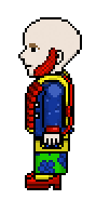
goofyzik
Opulent Obeisant


- I wanted to created something very regal yet modern. I wanted to challenge myself after looking at my designerology and create more variety as well as experiment more with my collection, with poses, silhouettes and colors. I had a difficult time incorporating vibrant colors into my outfits this term so, i used more vibrant colors for my collection till it gets to my last outfit and it's a mixed balance between the two. Each outfit represents a different statement/category. The first outfit represents Time/cycles hence the silhouette giving off the illusion that the body is twisting around while the stripes are twisting around it. The second outfit represents Resilience. All the fabrics are supposed to be intertwined and caught together to give off the illusion that they are wrapped around the outfit but also to tie in the previous outfit in a more progressive way. My 3rd outfit a hierarchy that's being represented by the stripes. 4th outfit represents the demeanour. A simple yet effective design with a clean construction is what i wanted to achieve with it. The last outfit i made represents opulence/power.
FILIP'S CRITIQUES
A great way to open up the show: it’s clean yet dirty, graphical and a bit evil. This is an effective way to have a black illusion piece lift your design up, it is not done this well very often.
I really want to like this but I don’t, something is just really off. I think it’s because it has a bit of a pirate feel to it which really doesn’t integrate well with the rest of the collection. I will say though that the black and red bag is really fucking cool and it is once again proof that you are amazing at creating separate pieces.
One of the best looks out of this whole finale: it is classical yet modern. You utilized the trampoline to achieve the effect of the tiny yellow dots all over the vest, you have really experimented with poses and angles which is formidable. I really really love the top and the blue dress that goes with it. The red doesn’t do anything for the design though.
I can’t quite put my finger on it, but there is something a bit erotic about this design, probably because this is a fashionable, editorial version of a flasher which is kind of funny. The skirt looks like a tumor which is the most interesting detail of the collection (hope I didn’t offend anyone there). This is refreshingly avant garde, a bit of 1800’s combined with 2021. By far the best outfit in your collection.
It is lovely to see some gold after four outfits with the same palette. A modern take on a Roaring 20’s outit, a bit The Great Gatsby. The skirt that integrates into the shoe is strange yet fascinating. I adore how you created a non-symmetrical print which makes for a high-end, opulent skirt.
summary
When I saw your collection I thought ”modern, expensive art deco” and I got the theme right without your explanation, which is a good thing. In a collection you must think about the order in which you present your designs: the gold dress would’ve been perfect in the middle to break up the red-blue-black palette which isn’t as impactful by the third or fourth design in a row. The avant garde tumor dress should’ve been the final look in your collection. This is a sophisticated, highly edited collection that is pleasing to the eyes: you show a great variation with your silhouettes which gives the collection a balance: some looks are a bit lighter, others a bit more layered and heavy. It is difficult to create an expensive looking collection with formal touches that yet upholds a conceptual art approach (art deco): it hasn’t been done much before as far as collections goes so you should definitely keep your head up high by achieving that.
AND THE WINNER OF LIDLTERM SEASON 1 IS...
Cinthia
Congratulations Cinthia, your perseverance and your insane talent for creating unique looks have made you the first LidlTerm champion and 500 coins richer. Your collection had the most heart, the most risks taken and it told a sentimental story which I'm sure will be different to each viewer, which is an amazing thing. Thank you for allowing us to get to know you better through it. Now prance! ♡
HerbyMainsted and Goofyzik, you two have earned 50 coins each for creating two distinct, remarkable collections. Both of you came very close to taking the title, which I say as a compliment: there is no doubt that you will both win a PR-longterm in a near future. Thank you both for helping me make this season what I wanted it to be.
When I created LidlTerm I wanted it to be a wild ride. I wanted it to be exciting, filled with versatile, aesthetically different designers and challenges that unveiled my love for fashion and pop culture which has shaped me into who I am. This season has exceeded all of my expectations and it honestly became the longterm I’ve imagined for years. All 26 of you who participated created an unpredictable, vibrant and fun season filled with iconic and interesting looks: some in unintentional ways - thank you. I tried my hardest to build a bridge between the PR community on Habbo and the TV show Project Runway because the TV show has changed me more than any other pop culture thing has, and it’s been a true privilege to show you all where I’m coming from.

cinthia - lidlterm s1 winner

