top of page

GRAND FINAL
.png)
.png)
LidlTerm S2 golden purse trophy

THE FINAL 3
.png)
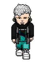


snawl
razzing
alydaman
Welcome to the final task of LidlTerm S2!
Snawl, Razzing and alydaman - my final 3, I am so thrilled and proud of you. Congratulations on surviving a complete bloodbath of a season. We started off as 18 designers and after 9 weeks of tasks that involved hungry competitors and insanely good outfits, the 3 of you are the only ones left standing. I've personally never seen a longterm in which the quality of submissions have been so high, so hats off and a big thank you to all 18 of you who took part.
For the final task, the final 3 designers were asked to create a 5-piece collection with a theme of their choice. The designers were asked to create a collection that represents the designer's personal touch, individuality and identity as a designer. Each designer was encouraged to be innovative and not play it safe. Another important criteria is that the 5 looks must be cohesive.


Checking in on LidlTerm S1 winner Cinthia
- How did it feel to win LidlTerm S1?
It felt amazing winning S1, just because i feel like nobody really expected me to but i worked so hard every week to try and create something new and interesting for the viewers as well for Filip.
- Why do you think you won over the other 25 designers who competed in S1?
I think I won S1 because i went more with what i liked myself as a designer instead of what i felt others/Filip would like best, I stayed true to my own style without the influence of others.
- What tip do you have for the final 3?
My tip for the final 3 would be, be yourself. Go for that outfit that you think is amazing, don't second guess yourself! Go with your gut, go with your style, go with what screams YOU.
- Thank you very much Cinthia, you will forever be known as one of the best designers Habbo has ever seen, the title as S1 champion will always remain with you.
LET'S TAKE A LOOK AT THE FINAL 3'S COLLECTIONS
razzing
clash of the patterns


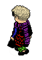


Razzing: I was inspired by RPDR All Stars 6 episode 5 runway - clash of the patterns. It's very me, edgy streetwear. I love patterns and obscure looking things. My collection is very noticeable and I love catching heads and eyes. This collection is very out there, just like my personality.


I’m very 50/50 on this one. I believe the bloody shoes and the tattoo are just too obvious and it turns this design into a bit of a Halloween costume. There are subtle and smart ways to portray things like blood and violence and in many ways, you already did that through the cool yet scary graphics on the arms. The neckpiece is incredible, it looks like a modern version of a ruff (that thing rich people wore around their neck in western Europe from mid-16th century to the mid-17th century) and I imagine it would be perfect for a music video, hence it would also photograph incredibly well in a photoshoot. That skirt is quite tricky to pull off, but you manage to. I enjoy the contrast of the blue suspenders; they bring a needed softness to a very hard and edgy look.


I smiled a little as you were submitting, you declared outfit #3 to be your masterpiece but in my eyes, this is the clear masterpiece of your collection. There is an electrifying feeling to this design and this is truly a clash of the patterns in a most perfect way: there are different colors and patterns here that are all aggressive and yet together the combination is spectacular. I believe this design works so well because the base is dramatic and voluminous yet forgiving because of the black color. The design reminds me of the graphical fashion that was on trend in the 80’s but you did it in a way that feels very modern as there are several details here that ties it back into 2021, mainly the fabulous black top and the shoes. It is masterful how you paired a texture-less black top/dress with black shoes that are texturized: the two are integrated and the transition is incredible. I also believe you didn’t just randomly put together 4 different colors and patterns; I can tell you really thought about the different placements. A green bag and a red pant wouldn’t have been as tasteful. I’m very impressed with this design and it’s one of my favorite PR-designs I’ve ever seen.

The theme of this collection is clash of the patterns and I believe you didn’t think about your final piece thoroughly enough. One will always be able to mix black and white patterns, no matter how different they are, without having them clash because black and white fabrics will always be in some kind of harmony with other black and white fabrics. We have barely seen black and white designs this season so I appreciate this look, especially because it manages to be avant garde, street-wear and at the same time there is a slight touch of elegance in there. I’d say that it’s actually very rock & roll and we haven’t seen that side of you before so well done. I especially love the tiny bow in contrast against the wings and the yellow little patch. This design is unfortunately a bit overdesigned, almost in the way your semi-final dress was, your eyes go all over the place in a way that isn’t so satisfying and it could’ve been fixed had you utilized a more neutral skirt and maybe used a different top. In Project Runway, balance is everything.


Again, your concept for this collection was clash of the patterns – there are several different patterns and colors to this design, but they’re harmonious and there is no clash. The color palette is absolutely gorgeous, and I adore how you mix a turquoise and purple dress with aquatic green shoes, it’s brilliant and they are probably my favorite shoes of the season. People have different opinions on how far you can go in creating different looks for a collection and still have the designs be cohesive, personally I am more forgiving about that topic and still I would’ve liked to have seen this design be slightly more connected to the other 4: perhaps through incorporating a little black or something else that gave it a harder edge that is present in the other 4 designs. I haven’t seen that poncho trick combined with that bag before and it made me ecstatic: that is a trick that represents the magic we can achieve through PR, it looks amazing. Having said that, I dislike seeing this dress (or maybe I should say the skirt) over and over again. Uhu did it in S1 (semi-final), MotormickeyNEW did it for Majesusterm (panel 2) and Herby did it in his winning collection on Snawlterm S7. Perhaps you didn’t know that, however I believe that as a longterm contestant it’s part of your responsibility to have some idea of what’s already been done before. I will compliment you on the orange socks, they elevate your design and overall, this is one of my favorite designs of your collection.


There is something funny about this design (in a good way) that I can’t really put my finger on, perhaps it’s the serious expression on your model’s face in addition to the hat which feels very American-theater-student-goes-to-Paris. I’m surprised that teddy bear backpack hasn’t been utilized more in this longterm and you spoil me with a great rendition of it, the teal shapes against the long black fabric is sublime. I wouldn’t really call this look a clash of the patterns but rather clash of the colors, because mixing those red heels with the yellow and the teal was an unorthodox choice and the oddness works well somehow. The white squared illusion going all the way down your model’s leg looks fantastic, again this is a good look that would’ve been even better with some further editing.
Final verdict
Every longterm collection ever made throughout the years represents hard work and dedication, I believe your collection is one in which the effort and the passion is the most evident. Everywhere you look you see the effort you put into the details, every single look in your collection is an event. You turned the volume up to 100, some may find that a bit too much, but I believe you spoiled us and put on a show with your collection, after all, the task was to create a fashion show. It’s impossible to be bored from your collection, watching it is like watching a thrilling movie at a cinema: you’ve created a fashion journey and at the end you feel quite satisfied as a viewer as you’ve gone to different places through the five designs. Throughout this longterm you always pushed the envelope and I’m very happy to see you didn’t stop that or overthink it in your final collection, there is a lot of confidence and unapologetic creativity in these designs. Your biggest challenge since task 1 has been that you need to edit and apply a critical eye to your designs. I believe you’ve gotten much better at it but there are still a few issues in your collection, certain aspects are just too much and are more RPDR than PR, for example the bloody shoes and tattoo in look #1. These issues are in many ways forgivable as your collection makes up for it by making many more rights than wrongs. I must give you props for a few editing choices: you didn’t apply an earring or a hat to every design even though you could’ve and might’ve wanted to. This collection is like fireworks and you are ending this season with a bang, congratulations.




alydaman
rising tides
Alydaman: I wanted to present something healing but fierce and something that came naturally to me. I've always had a strong pull towards the ocean or rivers and streams. My idea of heaven is when I was on a trip to Barcelona and went swimming in the sea and didn't come back to the beach for hours. I also discovered iamamiwhoami and their album BLUE around that time and was listening to it on the beach. That album really changed my life. Unfortunately, I live the furthest away from the sea you can be in the UK but for now I make do with hour long showers hehe. I also wanted to represent my journey in the PR scene and this competition. I feel like a wave that's been building and building and becoming stronger and surer of myself and I want to give in to my love of drama and pack some power into these looks. My idea was to do what I do best and show off some unique silhouettes and layers and have my looks building up to my final 'The Great Wave off Kanagawa' by Hokusai inspired look to finish just how I started this competition, with a bang!


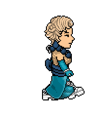
I adore this. The skirt is beautiful, it looks like water waves in an effortless yet complex way which is a combination that’s difficult to achieve (it reminds me of Leanne Marshalls winning collection from PR season 5, which is a huge compliment). I find it amazing that you could pair the skirt with almost any top and it would still be a great outfit. The gold details look superb in relation to the different shades of blue and teal and I appreciate that there is a bit of gray in there to neutralize the dress. Picking a texturized accessory (the fur) was a good choice as it adds diversity to an otherwise very graphical outfit. I must say that the black heels are a bit of a cop-out, you could’ve used so many different cool shoes with this dress. Anywho, A+ on the skirt.


I've rewritten the critiques for this outfit 3 times by now because I keep changing my opinion on it. My final take: it looks elegant and the design portrays strength, mainly because the fabulous necklace you've constructed looks a bit like some form of armor or an exoskeleton. I adore the subtle silver detail in the back. Matching those white details on the skirt with the shoes was absolutely brilliant, who would’ve thought those two items would merge together perfectly? This is a design that reminds me a lot of Chloe Dao's final collection from Project Runway season 2, just some nerdy input from me. Although the skirt-shoe trick is cool, I believe the skirt and the gloves are not on the same level as the other aspects of this design, likely due to the fact that the turquoise color makes the two items look a bit cheap, yet I don't find the two too distracting or unharmonious with the rest. This is a look I enjoy but I also think it could've been more perfect. Still, there is a powerful aura to your model so don't take the negatives too hard.


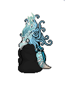
Some might say that this is overdesigned and doesn’t belong in PR, I disagree. In real life (and slowly yet increasingly in Habbo’s PR community), designers send out all kinds of crazy and impractical stuff on the runway with the purpose of creating a fantasy and making a statement. This isn’t conventional or very wearable but you know that and it’s obvious that was never your intention. Your design is one of the most avant garde things I’ve ever seen on Habbo. You found a smart way to portray this big splash of water (it looks like water hitting against a cliff with great force) because this could’ve easily looked messy, instead I find that there is balance in this beautiful and controlled chaos. Had you sent out 5 designs like this I would’ve thought it was too much, one statement piece like this is just enough. This is obviously not a conventional or practical runway outfit, it's rather a model wearing art. The earring is very satisfying and I don't want to take my eyes off this design. I enjoy going back and forward between this look and the more wearable look because this statement piece uplifts the 4 other designs.


One of my favorite designs of the entire season. I love the layers and the rich mixture of textures. From the side it looks like still glittering water and as your eyes move down, it transitions into seafoam in movement. It’s interesting how this design comes of as both clean and dirty, mainly due to the color palette and a subtle yet effective use of black accessories which looks very cool. The fur tail makes this dress a bit surreal and it might not be for everyone but I appreciate how different it is. There are so many layers and details to this dress and yet it can breathe perfectly due to the smart composition. A dress that is edgy yet glamorous.


This design was necessary, without it the collection would’ve lost a certain youthfulness and a modern touch. In my eyes, it is editorial swimwear and it would’ve been idiotic to not have a swimwear look for a water/swim-themed collection. The tiny gold lining that is barely visible, near the upper thigh area, I find exquisite. The layering in this design isn’t revolutionary or brand new but your take on it is very satisfying and it does wonders for your collection as a whole. There are tons of volume to it and it also feels very relaxed, your design perfectly represents that feeling one gets as they play around and swim in a body of water, there is a liberating quality to it. The mixture of blue shades looks perfect and I appreciate the white and texture-less earring which stabilizes the design. One last thing, you creatively extended the volume of the scarf by using a rat tail, it gives it a more vibrant and interesting shape, a shape suitable for the water theme as the rat tail looks like a tiny surfer's wave.
Final verdict
Water can be rendered in so many ways: it is a dangerous force as well as a life-saving source. In this instance, your collection represents the healing and soothing powers that water has, it reminds me of times when water and man collaborate, like when you go surfing or simply float on your back. Almost everything looks high-end and expensive but it’s also not pretentious or too classy and I am happy there are several pieces that keeps this collection modern and within 2021, without them this collection could've looked too dated. I applaud the fact that your collection contains both an avant garde design and more wearable and conventional designs without ever losing the conceptuality and creativity. I must say that I think you could've spent a little more time on picking shoes because a few of these designs would've been even better had you dared to utilize shoes in a more daring way. What takes this collection to the next level is the fact that you mixed your talent for designing and a lot of thoughtful styling with your emotional life and memories of a healing time and place in your life. The collection has your heart and your fingerprints all over it. I love this collection, all of your high efforts resulted in greatness.
snawl
a new kind of bright


Snawl: The entire collection is inspired by the music from Lorde's song "Solar Power". I've listened to it in my background throughout 100% of my collection's construction, and I believe the collection is best enjoyed while having that song play. The song has a music video but the video has 0 impact on my collection, it's all from the music. The name of the collection is a double entendre: It's a direct quote from the song, but it also is referring to me & my style. I am embracing bright colours now more than ever in a desire to grow myself. For too long I've restricted myself to murky, muddy, decomposing palettes.


How do I even describe this look? It’s perfect. The way it looks like the colors are introverted on the top compared to the bottom, just perfect. It’s a dress that looks both incredibly intricate and yet very effortless. I’ve said it many times this season, but it bears repeating: you are an absolute pro at accessorizing and styling, you chose a pair of shoes that are in the same colors as the dress but in different shades: therefore, they do a great job at standing out while they also compliment the dress, it’s masterful. It’s a dress that feels very 2025 and I mean that as a compliment, ahead of its time. This design wouldn’t have been as great had you gone the expected classy/elegant route with a pair of heels, instead you had the balls to match this with more high-end sporty accessories. A+


This is the best thing you have ever designed, ever. The top looks astonishingly expensive, it’s packed with gorgeous details without it looking cluttered or overdesigned. I study history and this whole design reminds me of something I’ve seen in my history books, I want to say Ancient Egypt mixed with Northern/Western fashion in the 19th century but that’s just me being weird, of course this is a design that mixes the past with the present. I’ve used and seen that skirt with that pose many times and you managed to find the perfect shade of blue for it, you render it with an extra depth to it which I’ve never seen before. I often talk about how some designs tell stories, there is no need to try to look for a story here because it only takes you a second until this design takes you somewhere, it portrays feelings of adventure and hope.


It is risky to submit something like this in a collection, I applaud your courage and I can gladly tell you that the design serves a purpose. Sure, it isn’t the most exciting or impressive design we've seen but I still find that the design helps evoke the feeling of the overall collection: a relaxed and joyful evening somewhere by the waters in a western setting, a feeling of positivity towards the future (which is needed more than ever in these times). I find the structure of the jacket that is integrated into the scarf very interesting, and I appreciate how you mix strong colors with muted colors. This is definitely a design that helps set the tone and we rarely get to see designs like these in longterms and therefore I am grateful for this outfit.


Boho chic meets vaporwave party, I could see this design at a cool music festival or just for a party at the beach. If I have to pick one, this is my least favorite design of the collection, in no way is it bad (it’s actually great), it’s rather that my eyes automatically go to the other 4 looks. The mixture of different blues is great and having the jumpsuit be in an acid green with turquoise details creates an interesting effect, you manipulated the print and made it your own which is very impressive and it represents the magic we can make through the game of PR. An interesting thing about this design is that the jacket and the hat creates a calm feeling and then there is the jumpsuit which screams PARTY! - the contrast is unexpected and surprisingly nice.


I am clueless as to how you created the top that is underneath the jacket, it is so beautiful and yet so cool, it actually reminds me of some cool 80’s print. The blue collar aligning with the earring is gorgeous and it even makes me a little bit emotional for some reason: I don’t want to step on your vision, but the blue composition makes me think of the liberating feeling you get after you have cried over something. The acid green details is an addition that makes this a vibrant design with lots of energy to it. The white skirt is suitable, but it makes me question whether you chose it because you didn’t know how to really match the top half. It doesn’t look mismatched, instead it looks like your model put on the top and then looked around to see if she could find something that looked appropriate to style it with. Still, there is absolutely a purpose in having such a busy top paired with a more neutral bottom half, well done Brad.
Final verdict
A truly sublime collection, you have my favorite concept, without a doubt. You didn’t just apply a lot of colors carelessly; it impresses me how the collection is so colorful and yet each color looks carefully and playfully selected. This is not a tropical collection per sé, it’s rather a western beach collection that isn’t so obsessively summer-focused, we rarely see it in longterms which makes your collection especially refreshing. As I look at your collection, I can almost smell the scent of fresh saltwater. Although your collection has a carefree, cheerful and relaxed vibe to it, deep down I find a message about mental health and being in a better place than before. Your collection lifts me up, it puts me in a good mood, and it inspires me to take a deep breath and not care so much about work and chores. It is incredibly admirable how you have never compromised or lost your vision as well as your style as a designer, even if it has meant that you’ve lost previous longterms because of it. This fact makes you one of the most defined and memorable designers in the history of Habbo. This collection represents that: nothing is overdesigned and instead you only went as far as you needed to in order to make each outfit shine, which is perhaps your biggest talent. Since the start of this longterm you have continously showed new sides of yourself and this collection is the culmination of your journey, it represents a new Snawl along with all the great qualities of the past.
results
I spent a lot of time comparing the collections and thinking about my decision. This whole season has been difficult when it comes to making choices and this finale was no different. Believe me when I say that it breaks my heart that I can’t give the win to all 3 of you. After I finished writing all critiques, it dawned upon me who I feel deserves the title as champion based on the final collections.
the winner of lidlterm season 2 is...
alydaman


Congratulations Alex, you are the winner of LidlTerm S2. As the gossip page shows, none of your competitors predicted you to be a finalist and yet you went on to win it all. In the semi-final I advised you to mix your love for drama and flair with innovation for your collection and that is exactly what you did. Each week you submitted designs that showed how much you enjoy designing and all your outfits had your mark on them, you didn’t lose or compromise yourself even once which is a win in itself. You haven’t won because of your past performances, you’ve won because you came up with a really beautiful and captivating collection that mixes timeless elements with modern influences. You should be very proud of it. As the winner, you receive the title of LidlTerm S2 champion as well as 500 coins. Now go celebrate this win and take it all in!
Snawl, you are the runner-up. Even though you didn’t win, your collection is one of my all-time favorites and it’s close to my heart. I will revisit it many, many times whenever I need to be cheered up or inspired. I am so grateful for everything you’ve done for the PR community and your status will always remain legendary. I can’t wait to play one of your shortterms again. You are the only designer this season to never land in the bottom 2 which is remarkable. Keep your head up high and be proud, you proved everyone who doubted you wrong and your growth has been tremendous. Since you are the runner-up of LidlTerm S2, I am rewarding you with 350 coins, a prize I increased because I love your collection so much.
Razzing, you put up a mean fight all season and it has given you 3rd place, well done. You took the most risks and pushed the envelope the most in this finale and your approach is one many longterm finalists wishes that they would’ve had. I applaud you for not boring me once this entire season, you are by far one of the most unpredictable and talented designers I’ve ever seen and people are always interested in what you will do next, which is a quality that you can’t buy. I know you may be a bit disappointed, however, your collection is exciting and unforgettable and that is a win in itself. If you continue to practice your editing skills, you will be unstoppable in the next longterm you take part in. I showed Sonny/BUYARTPOP!!! all collections and he declared yours as his clear favorite! Because you got 3rd place this season, I am rewarding you with 200 coins.
Will I ever host LidlTerm S3? Maybe! I have the passion and the drive for it. If there are 12 designers who are interested in the beginning of summer 2022, I will happily do another season. I have so many ideas for it already and the elimination rules would be in the same style as Corlay's All Stars. We shall see what the future holds! I absolutely loved hosting this season and I am so grateful to everyone who was part of it and made it a truly great experience.
AFTERPARTY
TAKE IT AWAY, CASCADA!



.png)


.png)


.png)




bottom of page