top of page

TASK 8 INDUSTRIAL DESERT DYSTOPIA
Welcome to the eight panel of LidlTerm S2!
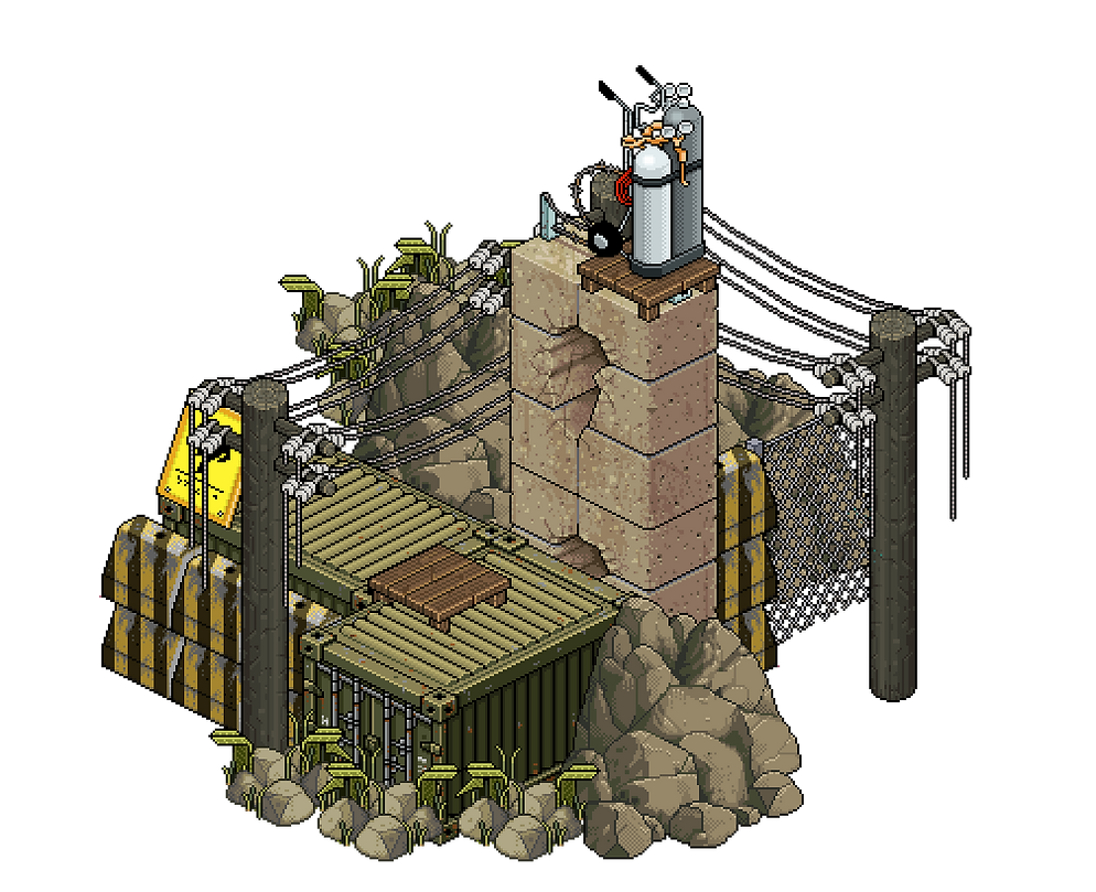
For this task, the designers were asked to design an outfit inspired by a dystopian and industrial location set in the desert. The concept was a location set in the future in which hope is lost, anarchy rules and the climate is overwhelmingly warm and dry. The criteria was to design an outfit that looks inspired by a hot climate and industrialism (an abandoned factory). The outfit did not need to be conventional for a desert. The designers were told that for this task I was looking for aspects of grime, dirt, dystopia, chemicals, metal, rust etc.
The inspiration for this task is a song from the video-game Ratchet & Clank 2 that plays on the desert planet Tabora. It is my absolute favorite song from any video-game. Hearing it makes me feel like I'm wandering a cruel desert on a hopeless planet while being on drugs in a way I strangely love.
.png)
.png)

Let's see who survived a visit to the abandoned factory!
snawl

This task fit you like a hand in a glove. Your design is the most avant garde thing you have ever created while it's also conventional in many ways. The base of your design looks like ready-to-wear fashion, it's the crazy details that truly elevates it and makes it fit the task criteria. I am very happy to see that you played with the loud factory yellow which makes your model fit into the photoshoot set perfectly. Just like in task 2, you decided to have fun with the accessories and I'm so glad you did because you have a real knack for it, everything above the neck is whimsical, charming and yet it strangely manages to also portray a more serious and industrial vibe. The big star of this outfit is the dark and sinister train, constructed by using wings and a tail: two items I think are very dangerous to use as they most often belong in Cozzie Change or RPDR, by making the two items black you managed to make them integrate into something completely new. I can't remember ever seeing something in a PR looking so dystopian or cleverly apocalyptic. The neon yellow gives off a toxic/industrial waste vibe and I commend you for utilizing two different shades of yellow in this outfit, the combination is fabulous.
MOTORMICKEYNEW


There are definitely industrial sides to this design and it’s an interesting one to look at. There’s a lot of color to it while it also meets the criteria of the task, to me it looks like the inspiration was metal and chemicals/toxic waste which is a fun take. The spiderweb skirt is so tied to Halloween and I wish it would’ve worked as something new, and it could’ve as you were smart when you colored it. However, along with the yellow, the purple, the red and the drapey black fabric this just comes across as a bit of a Halloween look, or a fashionista dressing up as a witch and not in the best of ways. Yes, you showed me other looks but I stand by my choice in saying this was your best option. There is something really charming about this look while it is also a bit unfortunate. Perhaps this design would’ve ranked higher in another task, because this design is more interesting than half of the stuff you’ve submitted prior, which is a compliment.
icearbr


Love how you played with the wires and made them look tangled in an industrial fashion, in fact you integrate with the hanging wires that are present in the set in a way that is both perfect and a little comical. I laughed when I saw the hat, last week I told you a hat would've brought some more charm to your design and this week you brought the most charming hat of the whole season. Interestingly, your design looks both dirty and clean, the clean aspect is achieved through the blue elements and the shiny black metallic arms. I haven't got a clue how you constructed the pants that are integrated into the shoes but I adore them and they couldn't be more suitable for a photoshoot at an abandoned factory. I believe you made the best color choices this week, having a really clean and bright yellow on the top makes the yellow on the bottom look extra filthy. My only complaint is that the task asked for something dirty, warm and kind of desert-inspired and I can't help but to think about water/rain when I see parts of your outfit. You had an incredibly strong concept and the execution was equally strong, well done.
razzing


You are one of the best designers Habbo has ever seen (which can be said about half of the LidlTerm S2 cast) but you have a tendency to sometimes make bad decisions. I’ve always thought it was such a cliché when contestants said ”I am my own biggest competition” but in your case it applies. You first submitted an outfit that I loved and which might have given you your third win, then you tell me -austin@troy- told you to resubmit this design which I don’t find nearly as good. Austin/Alan is an insanely talented designer, but he stumbled and finished 5th in S1 so I it baffles me you went with his gut feeling over your own. I really enjoy the dramatic and futuristic Dracula cape you’ve constructed, I’ve never seen it before and it feels very Razzing. In this context, I simply find the combination of the blue and the yellow to be an eyesore. The belt-necklace creation is neat but I feel like there is two sides of this outfit (the black vs. the yellow-blue) and they don’t work together. Does the design fit into the aesthetic of the task? Yeah kind of, this is a bit too sci-fi and Halloween for me but I will commend you on your creativity.
alydaman


Your design is the most editorial one of the bunch and I love the ombre effect, the hues of orange and yellow that you chose are absolutely gorgeous and it was a perfect choice to combine it with the dominant gray jumble of textures and details. I'm also a big fan of how you balanced this outfit: the intense textures are all in the center while the headscarf and the skirt creates breathing room. You absolutely nailed the desert aspect of the task and I can hear the Ratchet & Clank song when I look at this creation. I haven't got a clue how you constructed that bag but it's brilliant and I'm always a fan of seeing the feather boa used in clever and non-tacky ways. The photoshoot set that I created is dystopian and portrays an abandoned factory in a desert and I wanted to evoke a bit of fear, yet your design gives hope, perhaps due to the sunset color palette and because your model looks like a modern hero. You're not just good at experimenting but you also have the taste-level down, don't lose that.
.uhu

.png)
Ahhh ... it is so lovely to see a dress with lots of volume, color, textures and interesting details. You struggled in the middle of this competition but I feel like you've found your groove once again, don't let it go. I never thought I'd see that overused belt match the skirt so well but here we are, it looks great. You also brought a lot of Uhu-flair by utilizing sandals, something we rarely see in PR. Your design looks absolutely toxic, like it's soaked with chemicals. Having a white, semi-clean bandana/facemask next to the filthy dress creates a great contrast and it further adds to the illusion of how dirty and damaged the dress is. The blue accessory is unexpected but it does wonders for your design, it gives your eyes a rest from the screaming yellow and it creates a soothing feeling. You got all aspects of this task down: it looks industrial, dystopian, apocalyptic, toxic and like something I'd want to wear or see in a desert, brilliant job this week Harry.
results
I want the top 4 this week to know that I spent almost an hour trying to figure out which one of you I should pick for the win, you should all know that the 4 of you killed it this week. However, there can only be one winner. Congratulations Snawl, your metallic, dystopian, avant garde creation has earned you the win this week - not that it was necessary, but it captured the essence of the Ratchet & Clank song. Well done to icearbr and .Uhu who managed to get the two other top spots this week.
Sadly, motormickeyNEW is eliminated this week. Mickey, you are an incredible designer and I've seen you pull off technical tricks I've never seen anyone else do. On LidlTerm S1 you finished 23rd and this season you finished 6th - that is something to be proud of. One day we will see you as a champion of a longterm, unfortunately it won't be this season.

bottom of page